
During my holiday break, my classmate and I worked together to redesign the Tim Horton's application applying the UX research methods we learned during our capstone university course.
The Tim Hortons app allows users to enjoy the convenience of order and pay, earning and spending Tims Rewards, being able to quickly customize their orders and finding the latest offers all from their phones.
While the Tim Hortons app is widely used by customers, there are problems within the app that make it difficult for users such as the navigation and ordering process. How can we enhance the mobile user experience so that users have an easier time ordering?
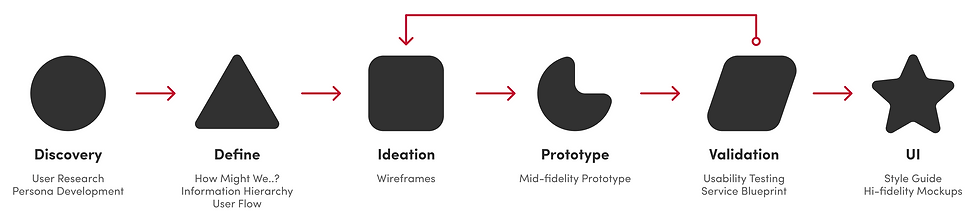
Since the app is only being redesigned, it was important to gather insights from users about their current experience. We conducted a system sustainable scale survey for both new and existing users as well as looked at previous app store reviews to understand the main issues customers were having.
Based on the outcome, three main goals were established:

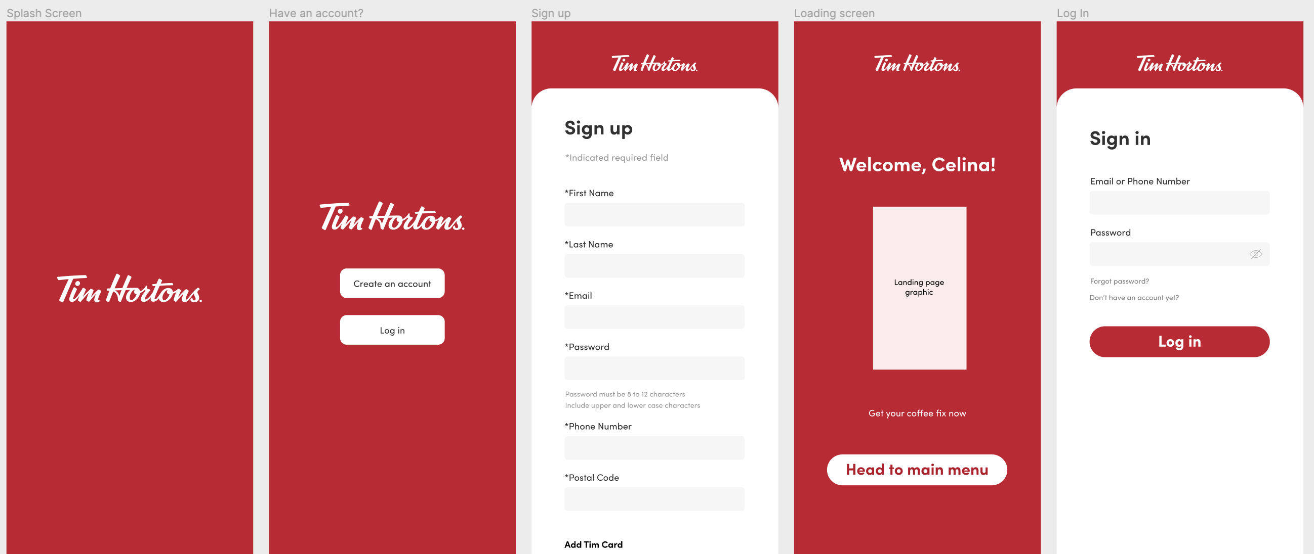
To create a more coherent
registration process for users

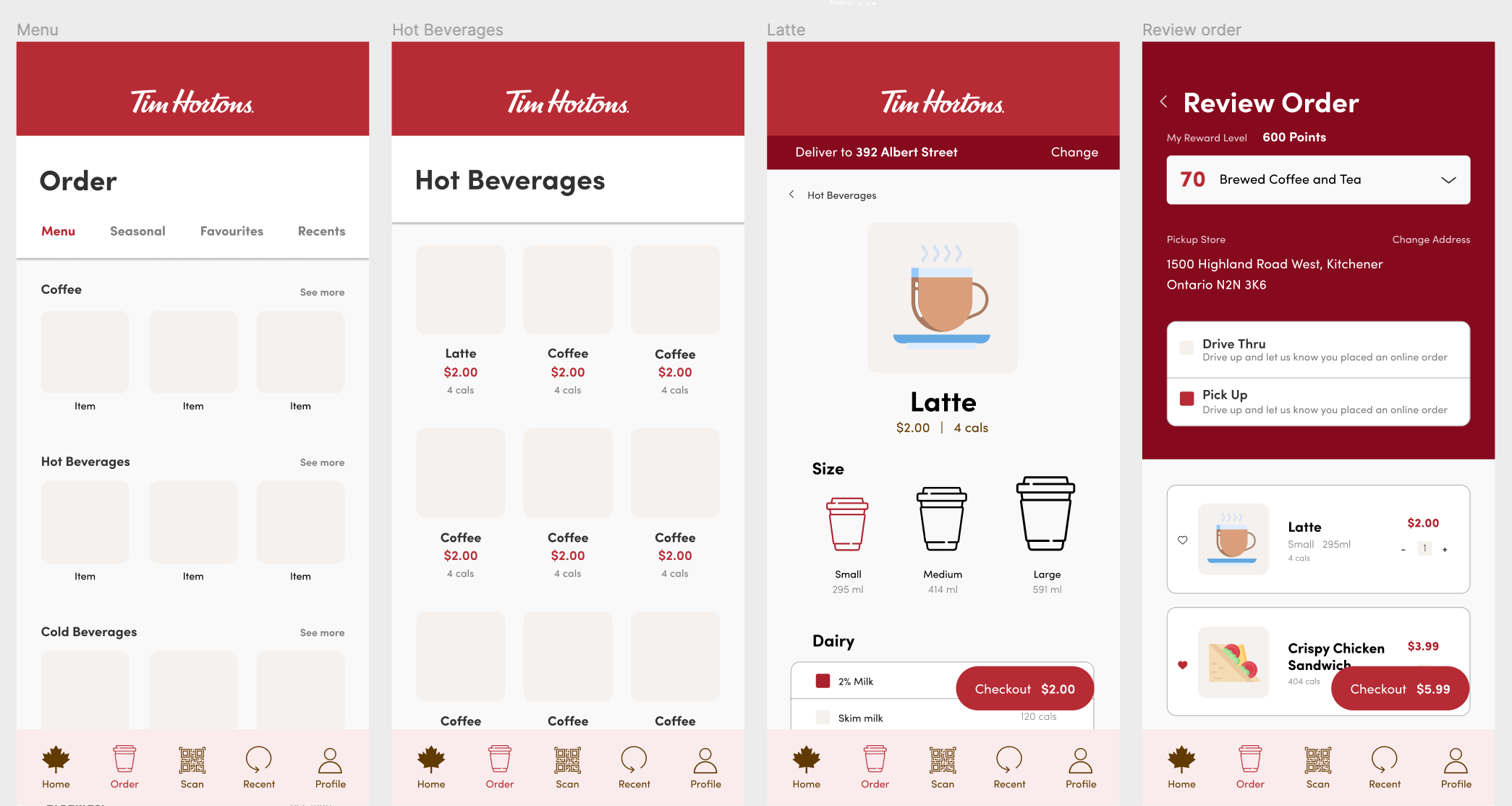
Allow users to discover
and navigate the app more smoothly
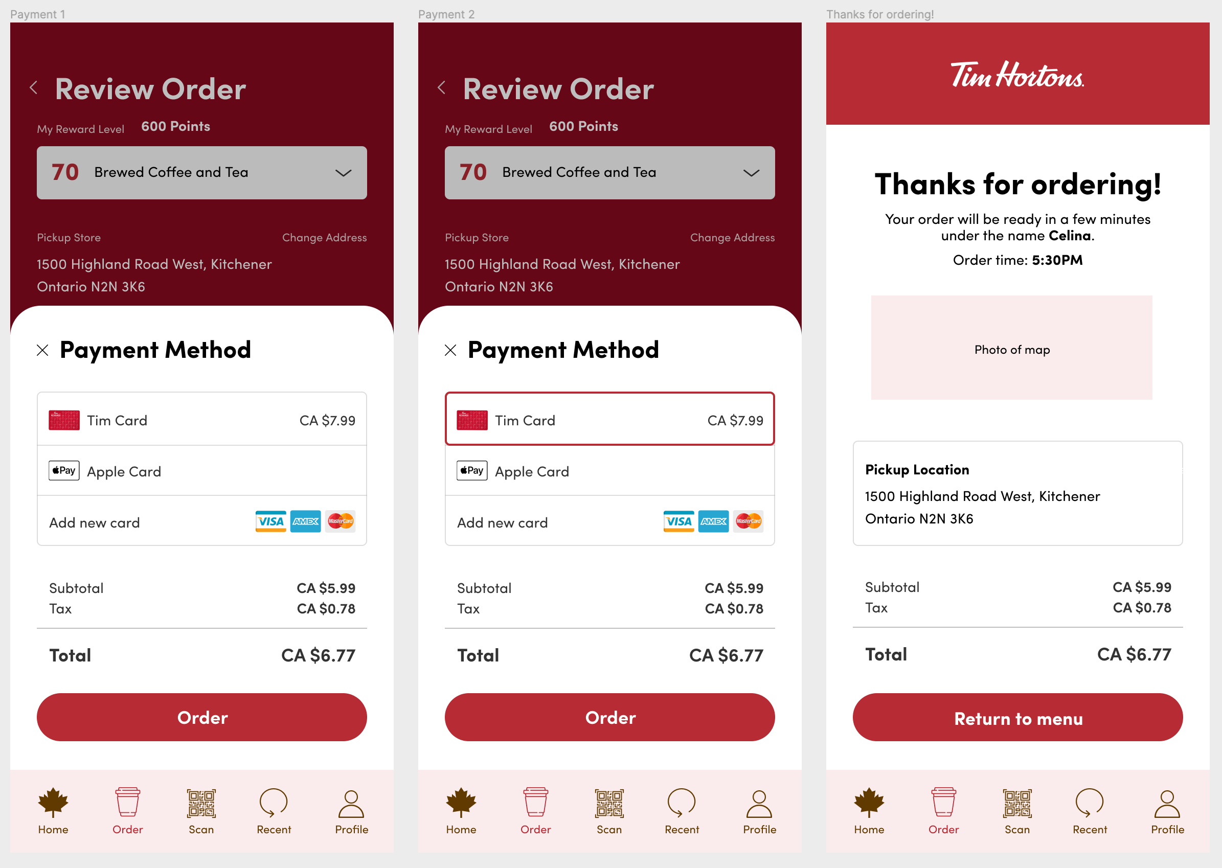
Make the order process
more customizable for the user
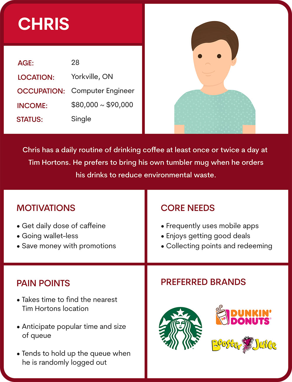
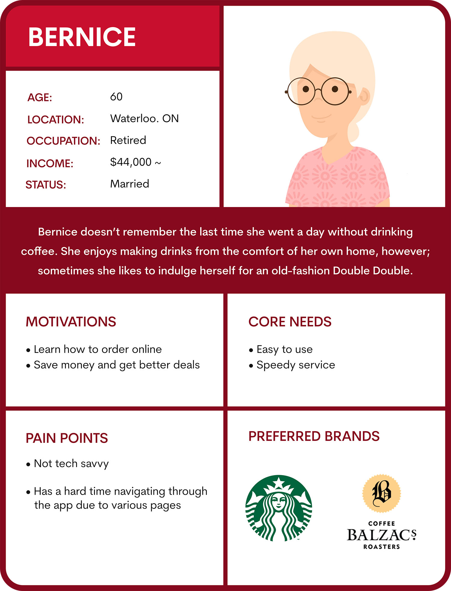
Tim Hortons is used by people of different ages so two personas were developed, Chris and Bernice:
1. Chris is an 28 year old environmentally cautious male who can't go a day without getting his coffee fix.
2. Bernice is 60 years old who loves a classic Tim Hortons Double Double.
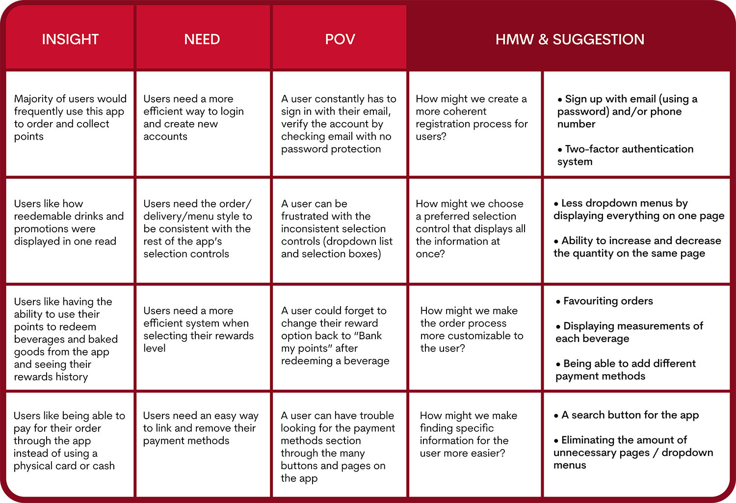
To brainstorm the necessary features, How Might We and Point of View statements based on our previous research and persona development of Chris and Bernice.
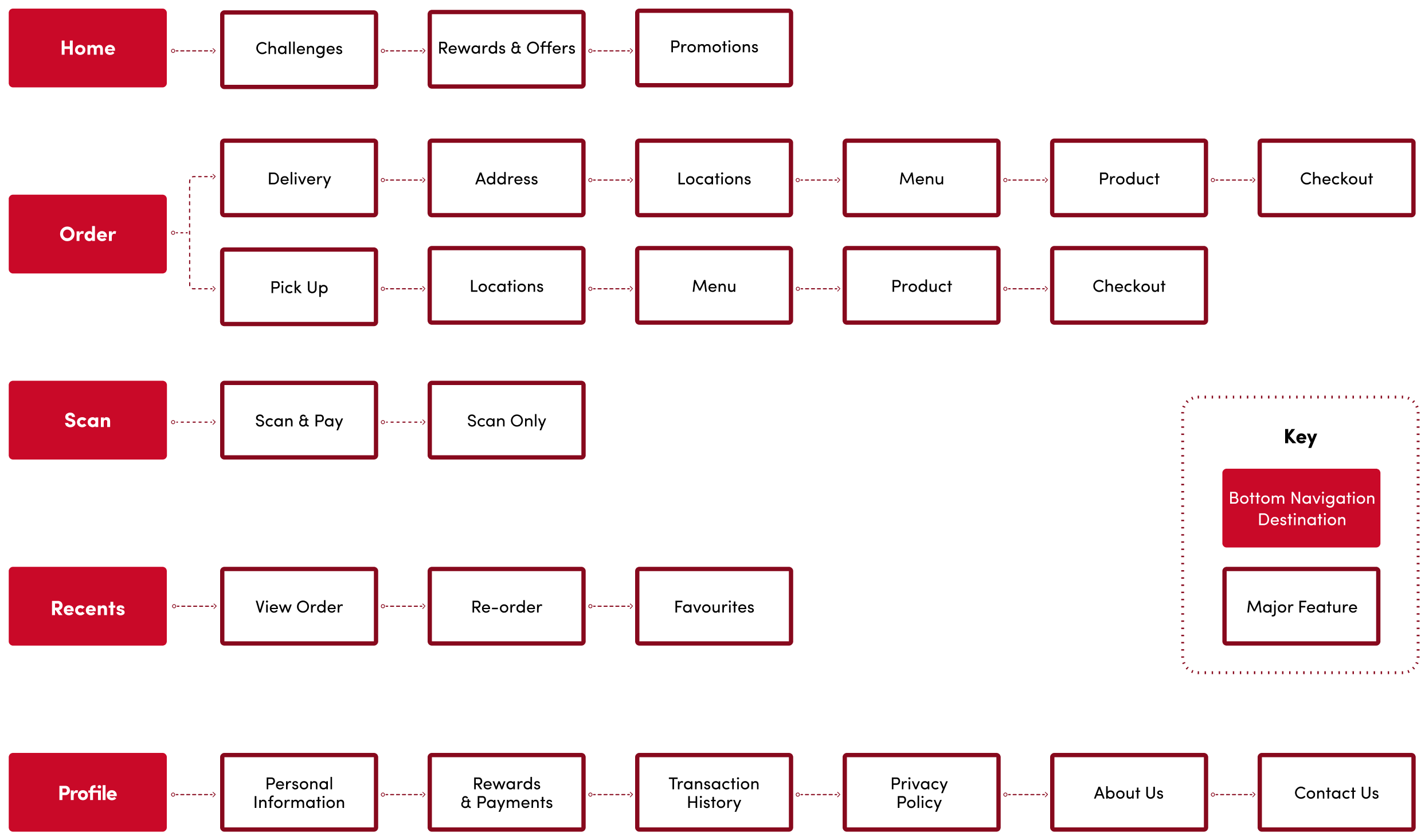
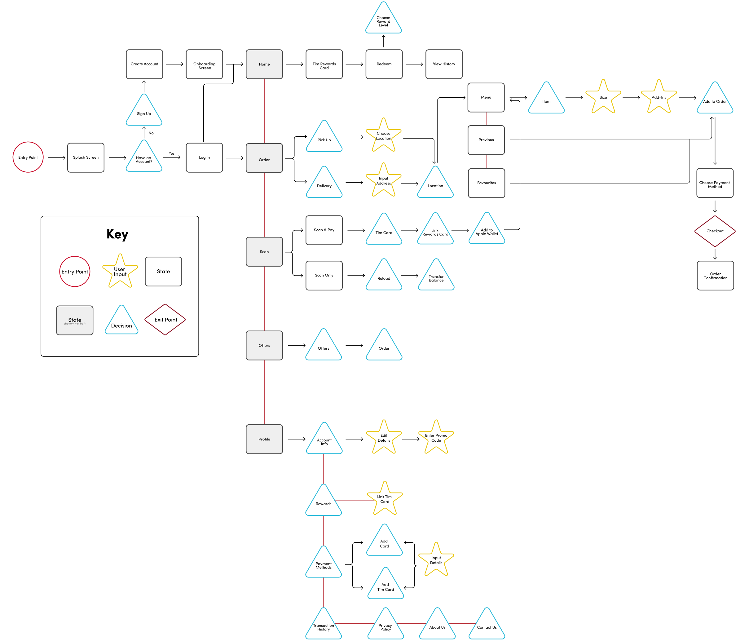
One of the main goals was to enhance the user experience which resulted in creating a flow that allows for seamless interactions between screens without any trouble. Considering that this is a food app, we had to make the process to order and pay for items, and use Tim Rewards fairly easy because users are on-the-go and don’t want to be on the app for long.
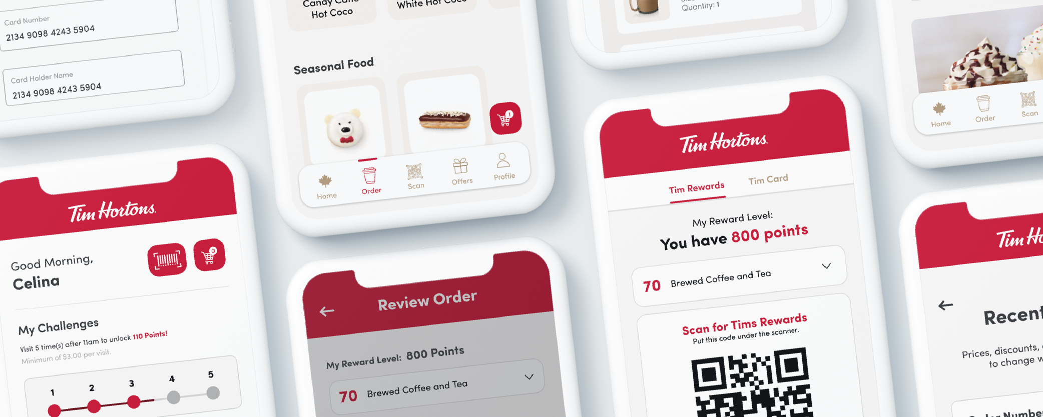
The flow caters towards both new and existing users showing the start-to-finish process of ordering and paying for items. It contains all of the possible interactions within the app from the five main starting points in the navigation bar: Home, Order, Scan, Offers, and Profile.
When creating the mid-fidelity wireframes, three main tasks were being tested:
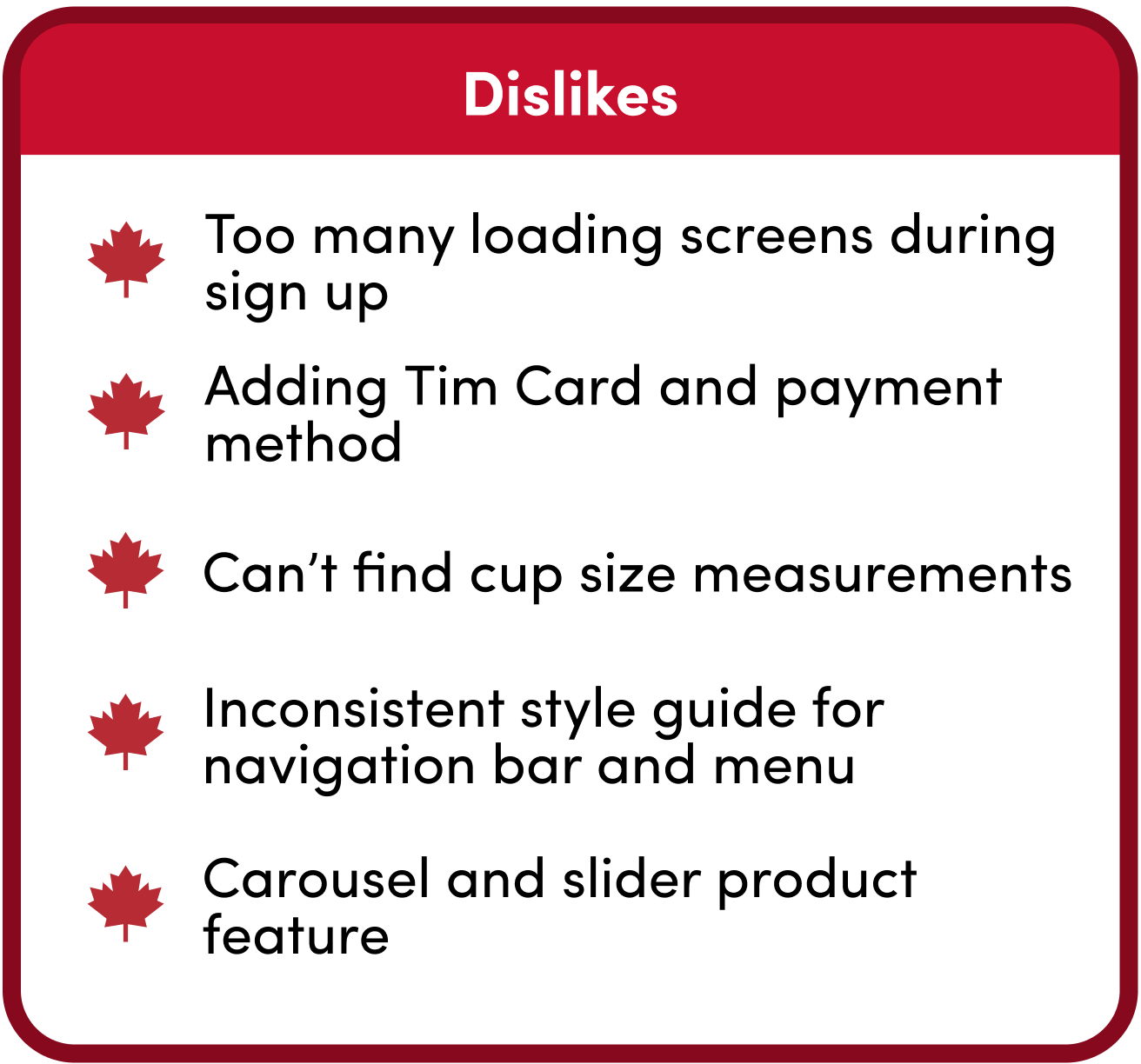
During the preliminary user testing on the mid-fidelity prototype, minimal context was provided for users as a guide to complete certain tasks. The goal was to identify and translate user pain points into goals, then solutions.
Tasks we tested for:
1. Easy onboard process and skeleton screens
2. Order listing screen with notable visual cues that a beverage can be customized
3. Adding card / payment screens using less elements and navigate without help
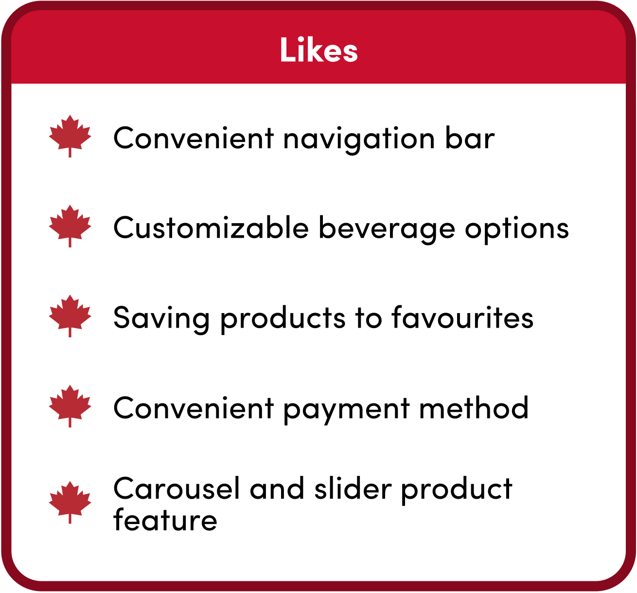
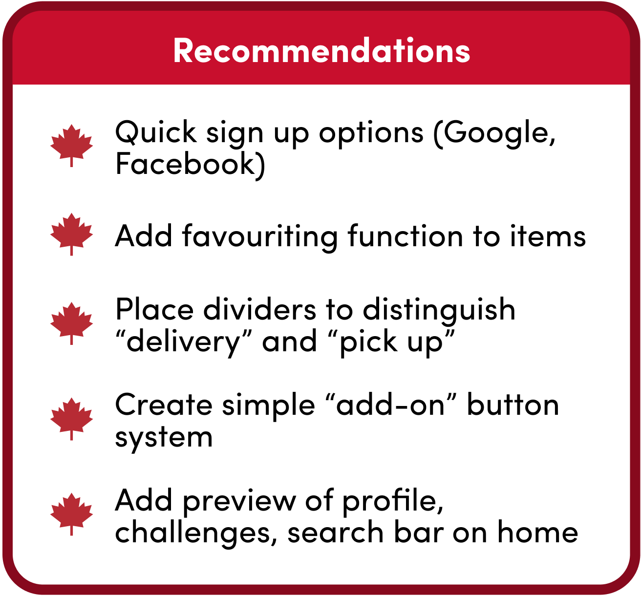
A few suggestions our users recommended were quick sign-up options with a Google or Facebook account on the registration screen, display "heart" functions to favourite certain items on the order screen, and an effective typographic hierarchy to organize content to follow natural eye movement patterns.
Customers are able to access everything from their homepage including their weekly offers, Tim Rewards, and see featured promotions.
Customers gets the option of pickup or delivery straight from the app - no need for going through UberEats or DoorDash.
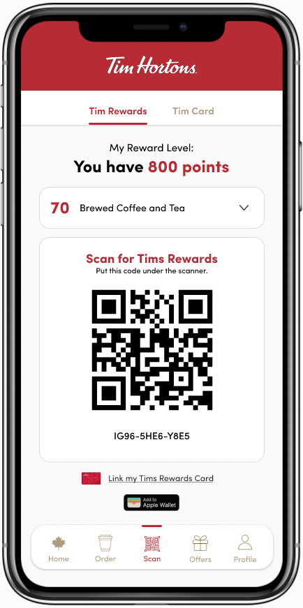
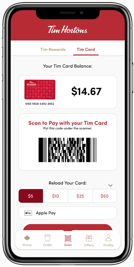
Use the Tims Rewards card to gain or redeem points with a simple scan!
The Tim Hortons redesign case study helped me practice collecting quantitative user behaviour data, analyze and transform them into qualitative data to support redesign thinking. After completing my program's UX course, I was very eager to start this project with fresh ideas and applied what I learned. I have also been a long time customer and user of the Tim Horton's app so it made me even more excited for this project.
Some unexplored features and future work we considered doing were: the ability to delete an item in the cart gift available coupons / redeemable points; experiment turning the navigation bar to a hamburger bar; apply more details to each menu item.
This project was very insightful as an upcoming UX designer and it helped with my confidence implementing functional design in both UX and UI. With consistent practice with case studies and UX research, I will continue finding ways to better structure the design principles and understand what the usability issues are.